Wednesday, 31 October 2012
Tuesday, 23 October 2012
Focus Group Questions
- Would you consider downloading an app to read a magazine on smart phones, ipads, iphones, computers etc
- Do you read music magazines? If so what type?
- How much are you willing to pay for a music magazine?
- What attracts you to read music magazines?
- What do you think can be improved on existing magazines?
- What would you like to see in music magazines?
- How do you like music magazines to be layed out? E.g. images, articles
- Would you prefer just one genre or a mixture of genres in a music magazine?
- Would you be interested in competitions or quizzes in a magazine?
Conventions
Front Page:
Contents Page:
- Short, memorable magzine title
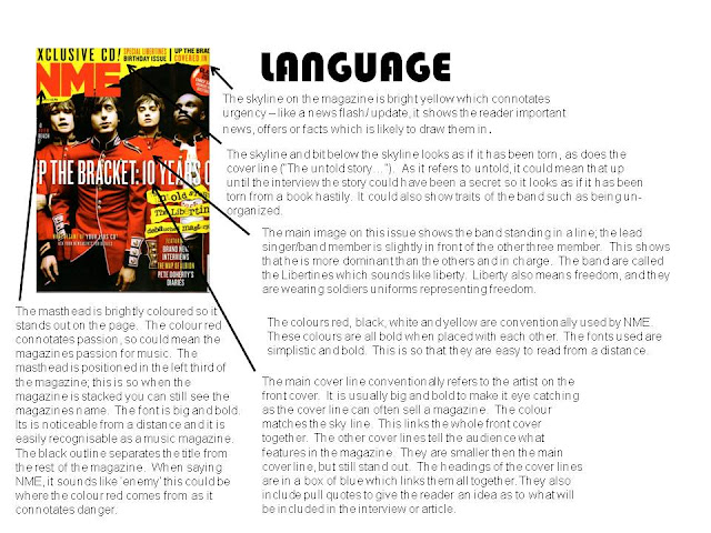
- Large, dominant icon, making clear the title of the magazine
- Subject's face can be easily and clearly seen, with eye contact
- Large, dominant, full page image of one of the main articles in the magazine (with a band displayed
- Bright colour scheme, with colourful clothing
- Thumbnails of other important articles
- Language techniques used to anchor articles
- Price
- Teasing contents
- Competitions and free gifts
Contents Page:
- Page title at the top of the page with the date of the issue
- Quoted from various articles
- Features section
- Images from various articles
- Continuous colour scheme throughout
- Images of artists both performing and on a set
- Page number giving reference to location of articles, with the name of the articles
- Large, clear font
- Few external advertisements from other institutions on the contents page
- Various language techniques
Double Page Spread:
- Page title at the top left of the page, indicating what the page contains
- Name of the artist in large, clear font, for big impact amongst other articles
- A continuous colour scheme used over two pages
- Introduction to the article
- The article itself, written in columns - clear font
- Contact details, to get in touch with the editor
- Highlighted quotes from the article
- Some text highlighted with large, bold, colourful font
- Many pictures of the band included over the pages
- Often contain 'extra information' columns
- Some text drags over the page
Sunday, 21 October 2012
Thursday, 18 October 2012
Media Brief
To design a front cover, contents and double page spread of a new music magazine. All images and text used must be original, a minimum of four images must be used.
Friday, 12 October 2012
Wednesday, 3 October 2012
Subscribe to:
Comments (Atom)


